Monday 22 August 2011

The Biscuit Factory, Newcastle

Alan Stones

   Plain Sailing, 2010, lithograph


    Dog, 2010, lithograph                                                                            Crossing 1st state, lithograph

Alan Stones lithograph prints are interesting due to their careful composition.  The well thought out positioning and scale of his subjects on the page are striking, especially due to their bold black and white contrast.  The subject themselves are a commonly explored area, but I feel that this time they have been done in an exciting way.  The simplicity of the peices really helps their appeal.
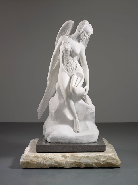
Joseph Rankin

          Bird 3, oil on paper                                         Cow 2, oil on paper


Of all the work I saw at The Biscuit Factory, Joseph Rankin's was the most exciting to me.  The twisted figures and anthropomorphic content really stuck in my mind.  His loose drawing and painting style, delicate use of colour with splashes of harsher tones work in perfect harmony with the subject.  This work has inspired me to use a looser brush approach within my own work.

Sarah Morpeth

   Box Book, ink, acrylic and wire                                  Torquils Book, ink, acrylic and wire             

After battling numerous times with cutwork, I really appreciate it as an art form.  Obviously, this technique can be made a lot easier with the use of a laser cutter, but nonetheless the results are always impressive.  These cut books by Sarah Morpeth are impressionable due to their intricate detail, and subtle addition of colour.

Anthony Stern
                                            Helix Chandelier, hand blown glass

   Various, hand blown glass


After spending half a year trying to blow a successful piece of glassware, I have great admiration for anyone who can use glass.  Anthony Stern is no exception.  The perfect forms and expressive use of colour and line within the forms is stunning.  The use of light within the work really shows the glass' full splendour. 

Sophie Layton

   Beyond the veil, 2010, ink on paper

Although Sophie Layton's work may not be the most extroverted of the exhibition, I find it has a subtle elegance that really spoke out.  The simple wash backgrounds and the pale prints of fabric are delicate and easy on the eye.


Saturday 20 August 2011

The Baltic Mill, Gateshead

Robert Breer  


   Float, 1972, resin, paint, wood, motor                                   
    
                                  
Rug,1968, two motors, golden sheet   Tableau, 1965, canvason structure, motor

 
                             Panorama 1, 2005                             Variations, 1970

                      Fuji, 1974, drawings from the film Fuji


If I am honest, I did not 'get' any of Robert Breer's work.  I often find it hard to appreciate contemporary art if I cannot identify with the making process, or see clearly the time put into a piece.  For example, 'Rug' instantly lost my attention for obvious reasons.  However, I did find his films a little more interesting.  The soothing French speaker on top of an array of Kandinsky style drawings was quite therapeutic and seeing the film frames helped me recognise the amount of work put into one film.


 Maurizio Anzeri

I am Red, 2010, synthetic hair, sewn threads    Twins, 2010, synthetic hair, sewn threads

Maurizio Anzeri was definitely my favourite installation. The small room featured 2 large sculptures, made of synthetic hair and stitch.  If anything, the scale of these pieces was impressive, each standing about 7ft tall with layers and layers of hair.  The braidings and weaving of the hair created appealing textures and allowed the hair to take sturdier form.  I think 'Twins' was especially enthralling, due to the nature of my own theme.

 
  Family, 2011, embroidery on print

                      Giorgio, 2010, Embroidery on print       2010, Embroidery on print  

The extensive amount of framed embroidered photographs was very exciting to me.  His geometric line work, with their precise stitch patterns and colour choices instantly grabbed my attention.  I was in awe of the way the stitched were taught, but did not interfere with the quality of the photographic print.

Mariah Robertson

     44, 2011, C-print on metallic paper

Again, scale played a large part in making this work successful.  The large reels of metallic paper printed with bold colours and forms made the work eye-catching, drawing the audience closer.  Up close, the smaller details were the more intriguing parts of the work. However, I must admit, this part of the exhibition did not get my juices flowing.

 
                             8, 2011, C-print on metallic paper    9, 2011, C-print on metallic paper


Overall, I felt indifferent to most of the work featured at The Baltic.  This is probably considered one of the most offending emotions when it comes to someone’s art, but I cannot help but feel like the work, with the exception of Maurizio Anzeri, was neither offending nor exciting to me.

Tuesday 16 August 2011

Leeds Art Gallery

Francis Bacon

 
                      Head VI, 1949

I have been a fan of Francis Bacon's work for quite some time, and his Pope series is top of my list.  In the past, I have created work based on this group of paintings, so seeing one in the flesh was really astonishing.

Ergin Cavusoglu

   Poised in the Infinate Ocean, 2004, 3 screen video installation with sound

Video art often loses my attention very quickly.  However this 3 screen installation by Ergin Cavusoglu kept me for quite some time.  The grand house and light house were particularly inviting, and I could not stop staring at the extravagance of each building.  I also enjoyed the transformation between night and day.

Frederico Camara

   Untitled [Tropical World, Leeds], 2007, colour photograph

    Untitled [Stuttgart], 2008, colour photograph

Frederico Camara's photographs of empty zoo enclosures have a haunting air about them.  I find 'Untitled [Stuttgart]' particularly eerie due to its surgical style colourings and open spaces.  The viewer may ask why the rooms are empty, and how come there is little trace of their every being life?  On the other hand, 'Untitled [Tropical World, Leeds]' does carry a feeling of warmth.

 Brian Griffiths

   Return of Enos, 2000, carpet, cardboard and tape

I think the most appealing thing about this sculpture is its materials.  Brian Griffiths uses nothing but simple household objects to recreate the infamous Enos, the first ape to go to space.  The combination has created the perfect replica that is quite endearing.

John N. Rhodes

   Study of a Skull, Book and Scroll of Paper, oil on canvas

Although this painting was the smallest in the room, I was the one I spent the longest looking at.  The detail and precise tones combined with the delicate brush strokes made 'Study of a Skull, Book and Scroll of Paper' one of the most realistic looking paintings to grace my eyeballs.

John Byam Liston Shaw
 
  Such is Life, 1907, oil on canvas

My main reason for including this painting in this review is down to my bad observational skills.  It wasn't until I returned home and looked over my photographs that I noticed the policeman in the center of the painting.  His looming dark presence is counteracted by the calm and accepting expression.

Damien Hirst

 
  Away from the Flock, 1994
                                Mantra, 2008, butterflies, household gloss on canvas 

                      The Anatomy of an Angel, 2008, Carrara marble

As many know, I have a great dislike for Damien Hirst.  I find his work over rated and his personality arrogant.  I constantly ask myself  what everyone sees in his work.  I can appreciate it's aesthetic appeal, but cannot help but constantly remind myself that he did not create the pieces himself.  I also bring up the question 'is this really art?', especially to 'Away from the Flock'.  Personally, I would not consider it so, but it is all down to personal opinion, so there is no definitive answer.